Uprising Pizza is a popular San Diego vegan pizza pop-up project founded by Ryan Crossley in 2020. When Ryan first conceptualized Uprising, he approached me to create a logo and fully developed branding system for this new start-up, and would eventually commission me again for a ranch bottle label design.
uprising pizza
uprising pizza
PROJECT TYPE
Freelance Branding Job
OBJECTIVE
Conceptualize and execute a logo as well as all branding assets and packaging for a new pop-up vegan pizza company.
CHALLENGE
Client wanted logo and brand feel to appear handmade and give off a more personable and informal feel to contrast with older, more established food companies and restaurants while appealing to young adults who like to visit trendy new food spots.
SOLUTION
Brands and logos that the client liked had simple color with a presence of black and a hand written look to them. I used this as an opportunity to use my hand drawn and hand written style of designing that comes natural to me to execute all branding elements including logo, icons, pattern, colors, as well as choosing an accompanying typeface. Then using this established brand system as the basis for an eye-catching ranch bottle label.
client inspiration
type & color explorations
Leaning heavily into my own hand-drawn personal illustration style, I settled on a type style that was simple and legible, yet organic and unique. Not informed the company name would be "Uprising" until later on in the project, I tested some hand type styles with the name "kronk's" initially, then began playing with the name "Uprising" once I had set on a type style.
final colors & logos
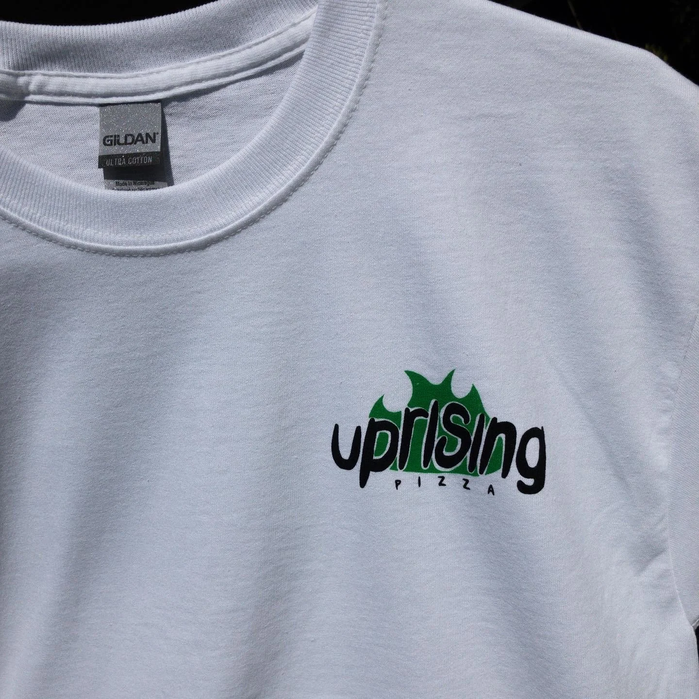
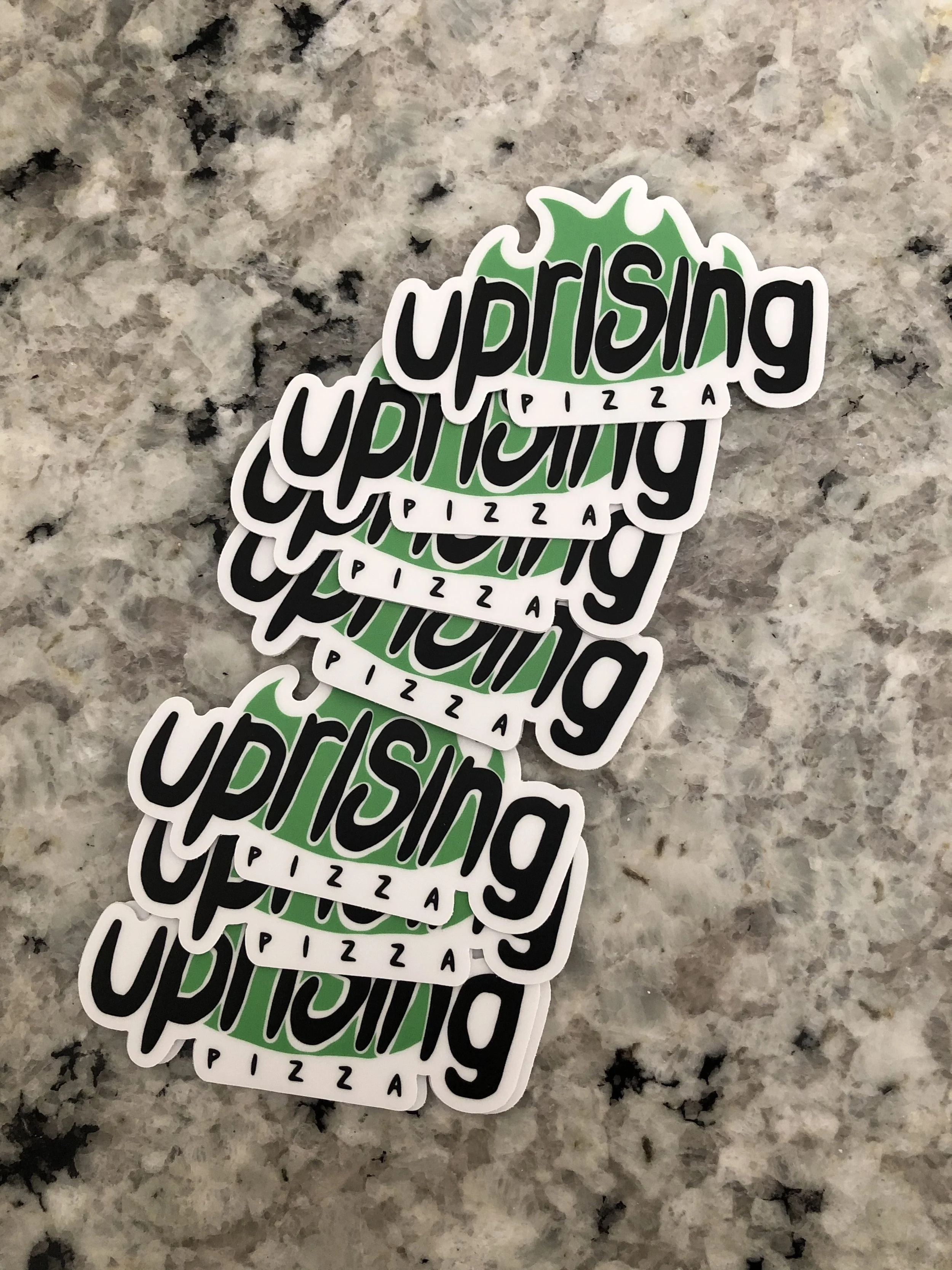
I chose the color black to make the logo look more contemporary and because many of the examples the client had shared with me to reference contained significant amounts of black in them. Since the client specifically wanted green to be present in the main logo and branding, I chose a green that wasn't too dark or too light for legibility. I chose a lighter yellow-orange as a third branding color because I thought it paired well with the green and black, and because it separates the branding with many past pizza branding concepts and styles that are dominated by the colors green and red.
logo in use
icons
Staying in line with the assets being hand drawn for this project, I illustrated all the icons on my drawing tablet. They are all one color with negative space as accents to remain as simple as possible while still containing a few details as to remain true to my illustrative style and to feel like a cohesive set.
With the target demographic of younger people who frequent vegan eateries in places like North Park and Pacific Beach, I kept the icon style very contemporary, simple, and a little cute.
typeface process
For the typeface, I wanted something on the modern and thin side to complement the more contemporary branding style I had going already. After going through a number of typefaces with the client, it was clear that we were moving towards a more simple and straightforward kind of typeface. I chose the Roboto typeface in the end because of its slender style, decent-sized font family, but most importantly for its very easy readability. Since this typeface will be used in things like menus, promos, and every other piece of collateral for both social media and print, it was imperative that it could be read immediately with very little effort.
patterns
To keep in line with the hand-drawn theme that I used in this branding system, I decided to come up with an organic pattern that matched this established aesthetic. I felt that a wavy pattern that wove into itself and could be tiled would be a good way to resemble both sunny San Diego and the culture that the intended patrons of Uprising Pizza have, being a interlinked community that goes with the flow, so to speak.
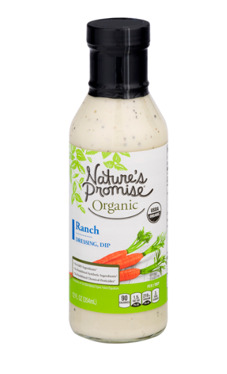
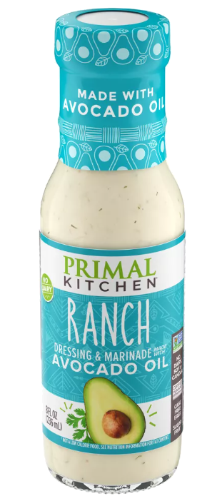
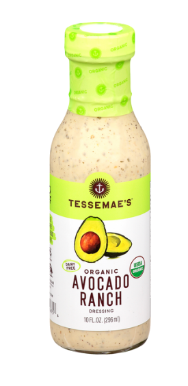
ranch bottle inspiration
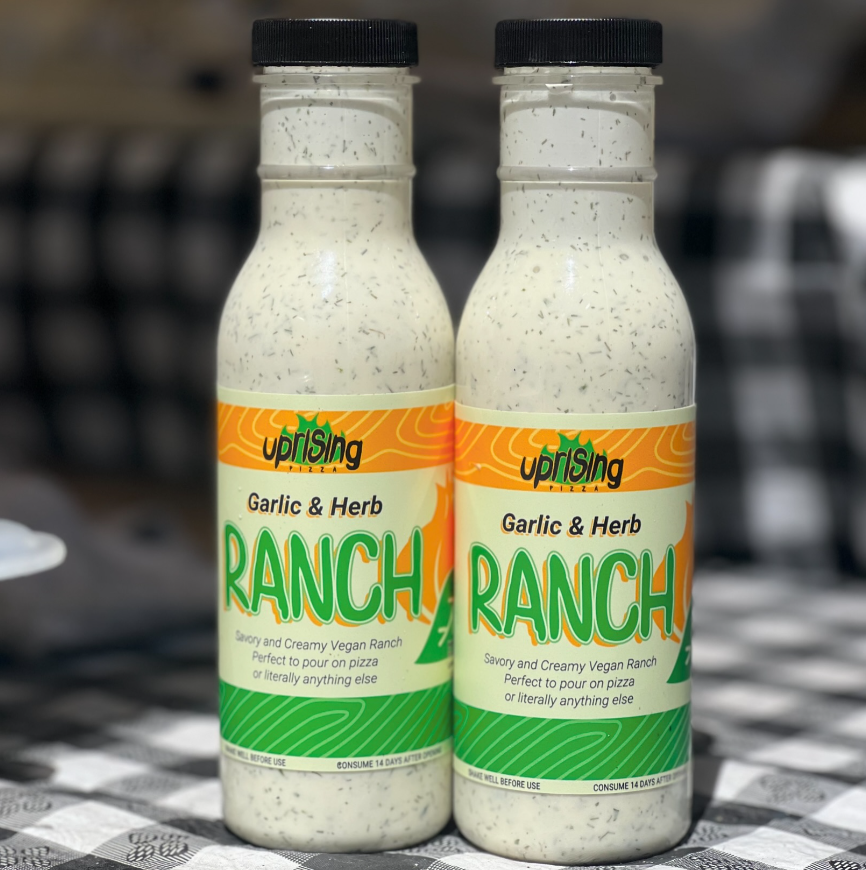
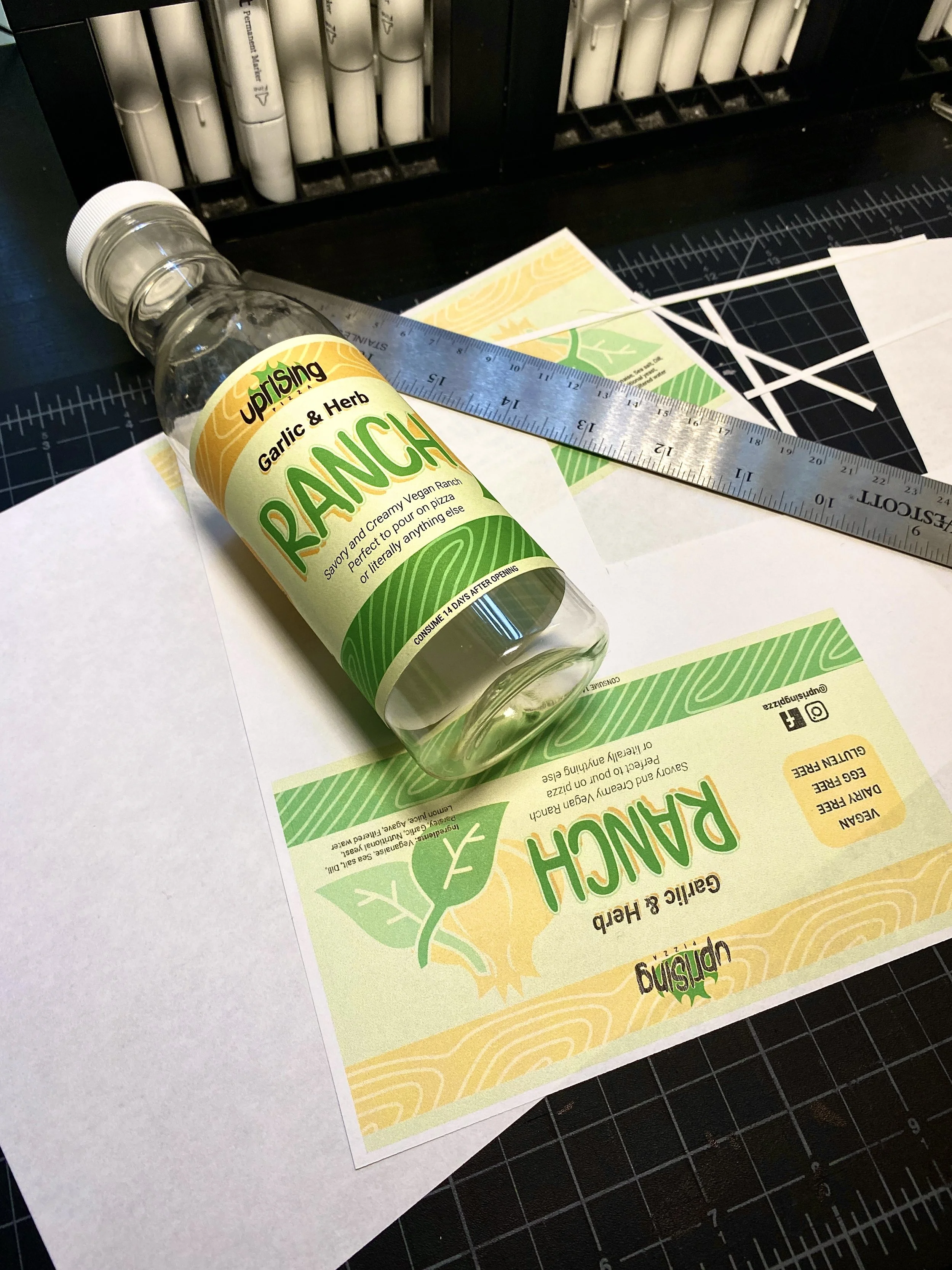
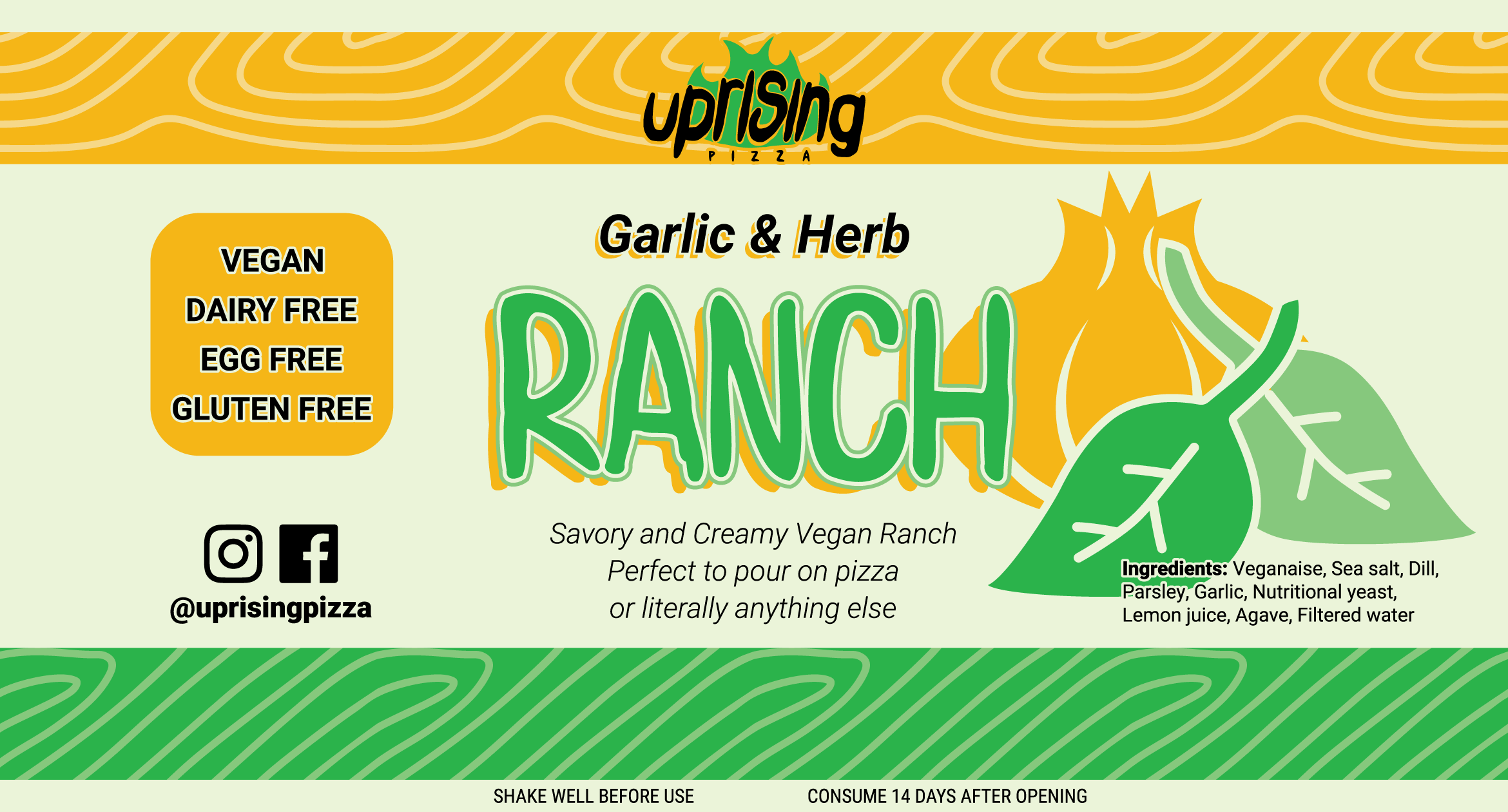
The client reached out to me at a later time to create a label for a new vegan ranch he was developing. Utilizing the previous branding style, I developed a bottle label that contained all the required information while keeping in mind good hierarchy and readability and also taking into account the physical form of the bottle the label would be used on.
final ranch bottle
I used contemporary organic condiment bottles as inspiration and built off this aesthetic. I wanted the bottle to read as a product that is healthy, organic, and small-batch. To accomplish this I hand-wrote the “RANCH” to have the product seem more relatable with a human touch and not a product that is mass-produced in a factory, along with drawing a few new icons.
branding assets in use
Gazebos not designed by me, only the branding assets on them.

