autonomous zine fest
autonomous zine fest
PROJECT TYPE
Assignment for Environmental Graphic Design course
OBJECTIVE
Create an entire event including branding, collateral, and venue design.
BRIEF
The event type I chose to design for was a zine fest. Zine fests are very informal expositions of zines, which are short, handmade booklets that can range from literature, to photography, to art, or anything else one can put into booklet form and print yourself. Zine fests embody the concept of DIY (do it yourself) very thoroughly. From the process of making the zines, to the people and groups that participate, to the way the events are coordinated and set up, everything is very "do it yourself". This is the antithesis of everything clean, corporate, and professional. Uniqueness and the human touch is very much embraced in these spaces.
SOLUTION
The concept of DIY was emphasized visually and incorporated into every aspect of the design system.
Everything designed is very minimalist and flat. What little text there is, is either hand written, or using a typeface that resembles a typewriter and fits this aesthetic. To fit with the high contrast nature of zine color schemes, I used black as the base color for most assets, and chose three vibrant, attention grabbing colors that worked together and just looked good. For any images used, I posterized them so they were very high contrast, so that when combined with the colors used, it looks like the assets in this system could have been offset printed, screen printed, or printed in some other way that contains the human touch.
logo & branding process
A zine fest is an event that is very centered around DIY, and I wanted the branding of this event to embody that idea. Having an aesthetic that is hand-made and resembling photocopied graphics was the goal for this branding system. I drew the logo concepts, patterns, and main type by hand to evoke the ethos of the established culture of zines and zine fests.
final logos & colors
In the final logo, I decided to layer two copies of it in different colors slightly offset as a call to printing methods like lithograph and more so risograph where slight imperfections and registration mishaps are almost celebrated. I also chose colors that pop when together and look like they could be a color palette used in someone riso printed zine or screen printed t shirt.
banners & info kiosk
Some crucial elements in a zine fest would be an informative kiosk and branded banners. I designed these deliverables using illustration and collage, which are both very prevalent in art zines. I posterized any images to refer back to photocopied graphics found in zines and kept any illustrative elements very graphic and high contrast to complement this, tying everything together in the DIY look and feel.
pattern
I played around with the main “A” mark in the Autonomous logo to get a repeating pattern. I mainly did this just because it looks cool and could be an asset to use where I need something that’s visually busy and staccato. And having the “A” repeat only reinforces the Autonomous brand identity.
imagery
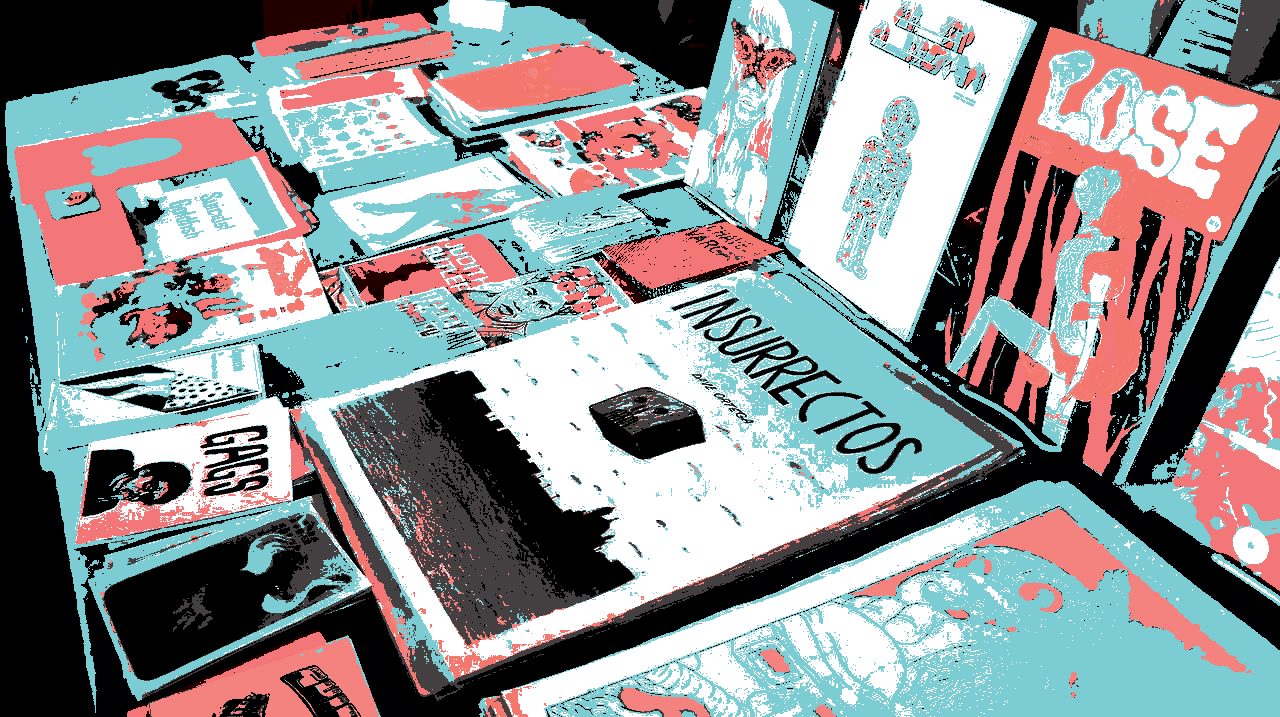
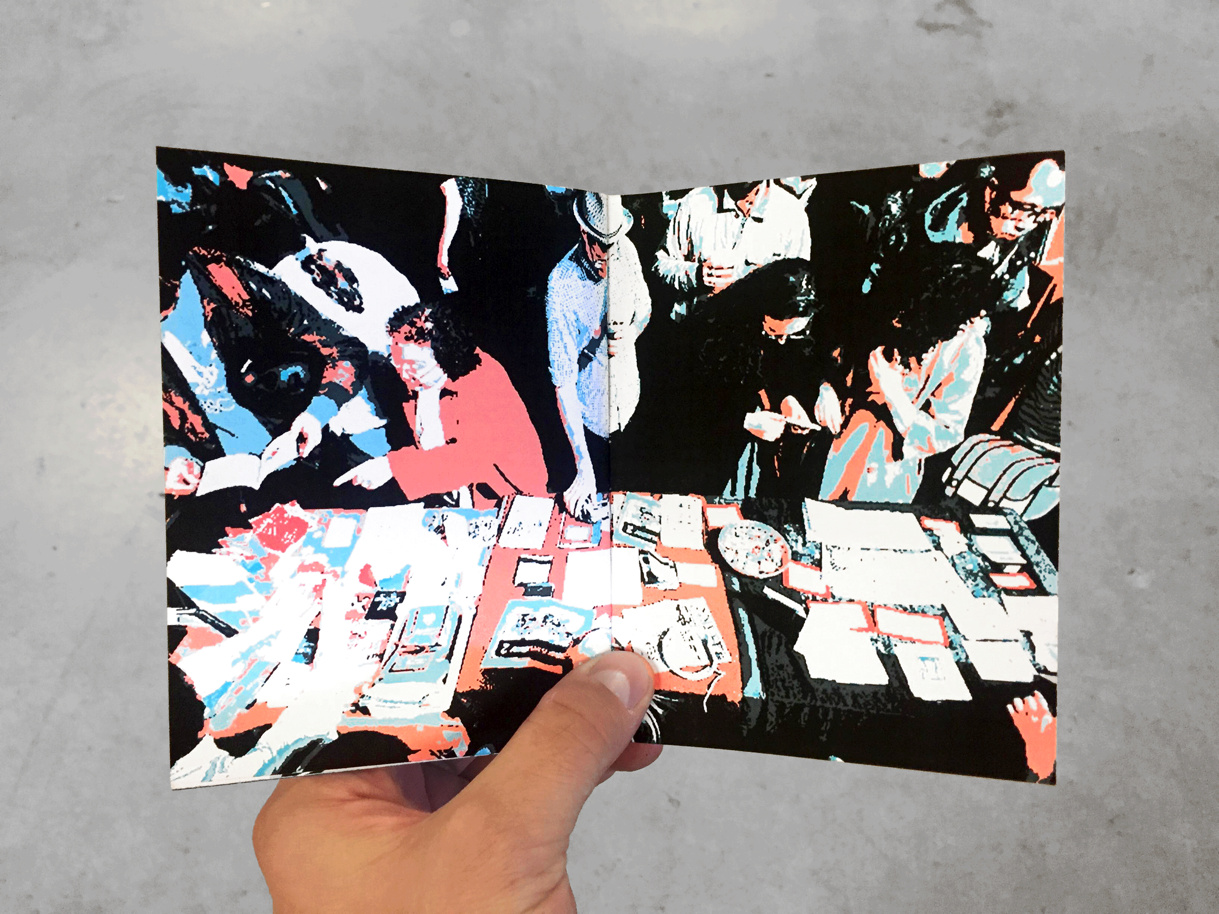
I wanted to capture the essence of being at a zine fest with the imagery I used. Using images of zine fests themselves, I decided to take it a step further and posterize the images using the Autonomous brand colors to draw a direct connection between the Autonomous brand and the zine fest experience.
zine fest recap booklet
Another deliverable I created for the zine fest was a booklet intended to highlight some main points of the would-be event. These included interviews with some of the vendors, images of the event, and some vendor spotlights. All of this content would be printed on matte letter paper and saddle stitched with a single staple in the spine to further drive home the DIY aesthetic and relate the booklet back to the event itself almost cyclically.
icons
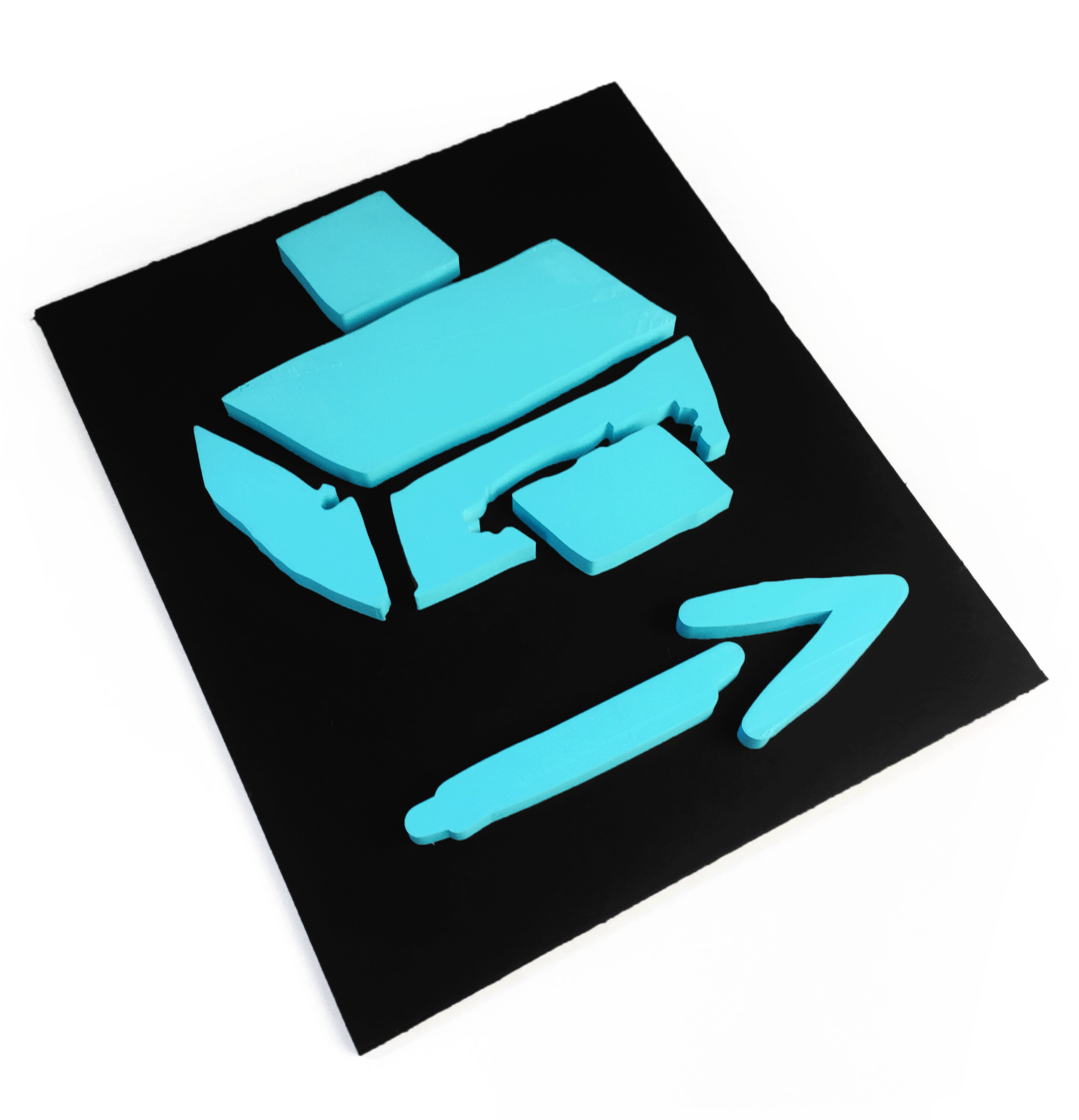
These icons reflect the main logo in appearance, looking very hand drawn or hand printed to further emphasize the concept of DIY. They represent various aspects of zine fests, such as printing methods, the zines themselves, and common amenities found at most public events.
3d printed signage
Incorporating the illustrated icons into physical objects was crucial to bringing the Autonomous brand to life and making the zine fest experience as immersive as possible. I had the main logo and some icons 3D printed to use as collateral and signage to make the icons and the Autonomous brand seem more real and tangible and have them stand out more than just images on a flat sign.
site sketches & elevations
For brand continuity, these tables were designed based off of the A form of the main logo. However, I also positioned the tables in such a way to where the foot traffic can flow along smoothly, zig-zagging from one table to another. The two designed kiosks are also based off the A form to create repetition and brand recognition. One kiosk is found at the back of the venue containing the free convention zines, while the other is found in front of the venue containing information regarding where to find different things, and also containing branding assets and imagery.
venue model
For this mock event I created a scale model of the venue featuring branded wall designs and 3D printed tables. I tried to have as many of the features that I could reflect the Autonomous brand, with the main doorway being in the “A” shape, as well as the tables, and reusing the posterized imagery for banners to hang on the walls.


